
Bootstrap: Basic
This page will be my journal learning bootstrap responsive CSS framework.
Apply Bootstrap
I can copy and paste below code on top of the html from official bootstrap web site.
<link href="https://cdn.jsdelivr.net/npm/bootstrap@5.1.3/dist/css/bootstrap.min.css" rel="stylesheet" integrity="sha384-1BmE4kWBq78iYhFldvKuhfTAU6auU8tT94WrHftjDbrCEXSU1oBoqyl2QvZ6jIW3" crossorigin="anonymous">
Make images mobile responsive
Put img-responsive as a class in the <img />
Example:
<img class="img-responsive" src="assets/logo.png" />
Center Text with Bootstrap
I can add more than one class to the same element.
<div class="blue-text text-center">...</div>
Create a Bootstrap Button
I can make the button by adding a btn and btn-default class.
<button class="btn btn-default">Button</button>
The scale of this button will be small, but if I want to make the button would take up 100% of the available width, I can use below class.
Create a Block Element Bootstrap Button
I can make the button with 100% of the available width by adding a btn-block class.
<button class="btn btn-default btn-block">Button</button>
Taste the Bootstrap Button Color Rainbow
If I want to make the button colorful, I can use class btn-primary
- Notice that replacing
btn-defaulttobtn-primary
<button class="btn btn-primary btn-block">Button</button>
There are lots of different colors for informing users. Bootstrap official web site Check it out.
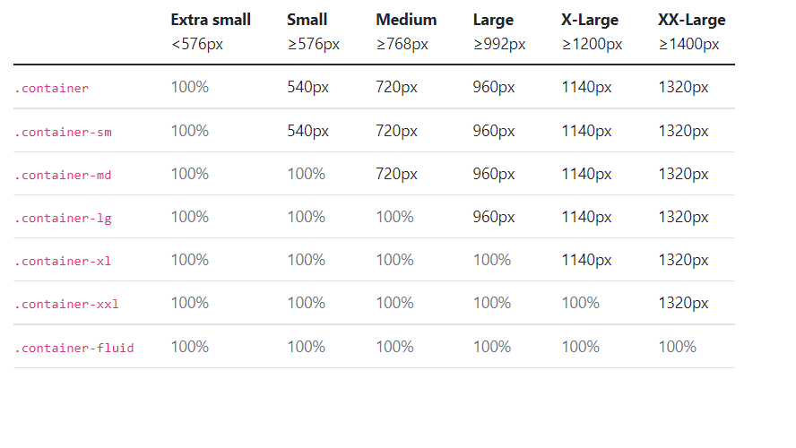
Use the Bootstrap Grid to Put Elements Side By Side
Bootstrap uses a responsive 12-column grid system. I can use col-md-*. md means medium, and * is a number specifying how many columns wide.
x-small : col-xs-*
small : col-sm-*
medium : col-md-*
large : col-lg-*
x-large : xl-sm-*
xx-large : xxl-sm-*
The code has three contents as three columns.
<div class="row">
  <div class="col-xs-4">...</div>
  <div class="col-xs-4">...</div>
  <div class="col-xs-4">...</div>
</div>
Responsive images
<img src="..." class="img-fluid" alt="...">
<img src="..." class="img-responsive" alt="...">
Font awesome Icons
I can use the icons by adding the code at the top of the HTML
<link rel="stylesheet" href="https://use.fontawesome.com/releases/v5.8.1/css/all.css" integrity="sha384-50oBUHEmvpQ+1lW4y57PTFmhCaXp0ML5d60M1M7uH2+nqUivzIebhndOJK28anvf" crossorigin="anonymous">
After adding it, I can search the icons that I like in this official web site. Font awesome official web site
And then, copy the code and paste it.
<i class="fas fa-info-circle"></i>
I can use the icon within the button like below code.
<button class="btn btn-block btn-primary">
  Like<i class="fas fa-thumbs-up"></i>
</button>
Container
<div class="container-fluid">...</div>
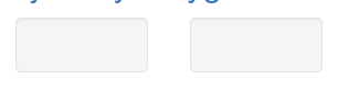
Well
I can create a visual sense of depth for my columns.
<div class="row">
  <div class="col-xs-6">
    <div class="well"></div>
  </div>
  <div class="col-xs-6">
    <div class="well"></div>
  </div>
</div>

Leave a comment